| | Junior Resource Sector Crisis Center
Publisher: Kaiser Research Online
Author: Copyright 2014 John A. Kaiser
|
| |
| The Junior Resource Crisis Center is a collection of graphics created by KRO which depict statistics about the financial health and financing activity of the Canadian listed juniors covered by Kaiser Research Online. |
 |
 |
 |
 |
 |
 |  |
 |
 |
 |
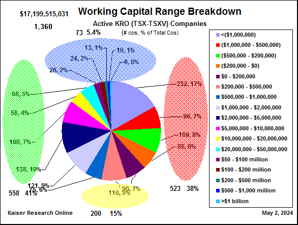
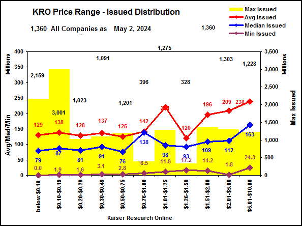
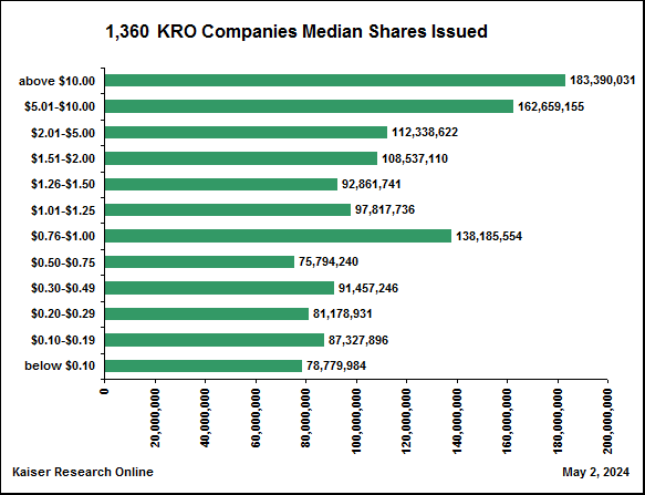
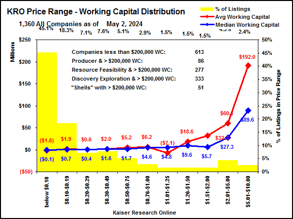
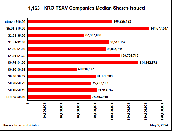
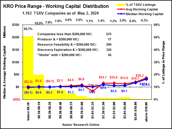
| The price distribution chart above portrays the number of companies featured on KRO which were trading in each price range at the end of each month. The 2 charts below provide information about the number of shares issued and working capital levels for the companies in each price range. The first 2 reflect all the KRO companies which includes some ASX listed rare earth companies and a few major mining companies. More interesting are the TSXV specific charts below because the TSXV is the spawning ground for the juniors. In the Issued Distribution charts the yellow bar corresponds to right y axis and represents the maximum number of shares issued. The red and blue lines correspond to the left y axis. Of these the blue median line is most interesting because it shows the number of shares issued at which half the companies in the price range have less issued, and half have more issued. The same applies to the working capital charts. What we can see in the TSXV charts is that among the cheap companies there is not much working capital in their treasuries and there is a lot of paper issued. The implication is that a very brutal rollback cycle lies ahead for the majority of TSXV juniors, with the result that we will end up with a sea of shells lacking sufficient capital to pay for the overhead of maintaining their public listing. This is a structural problem for the industry whose only solution is a massive purge of this surplus of ineffectual companies. |
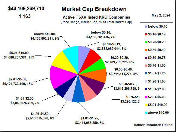
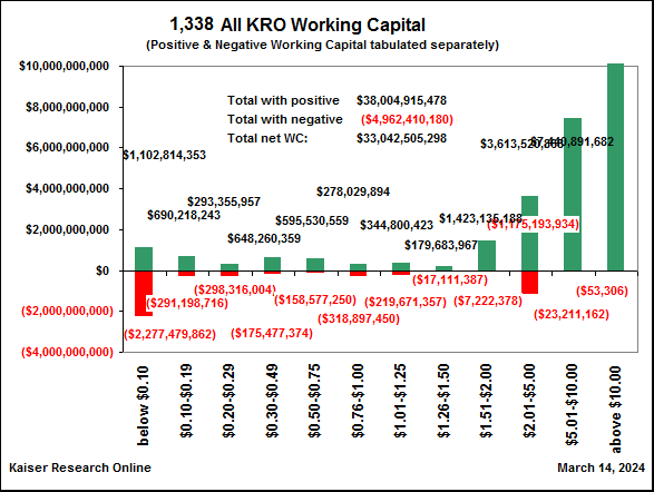
| Statistics for all actively trading TSX/TSXV listed companies featured on Kaiser Research Online |
|---|
 |
 |
 |
 |
 |
 |
 |
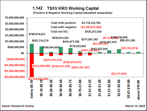
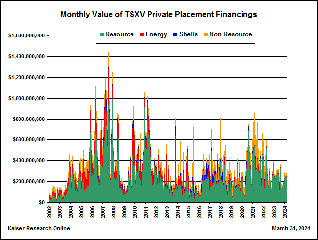
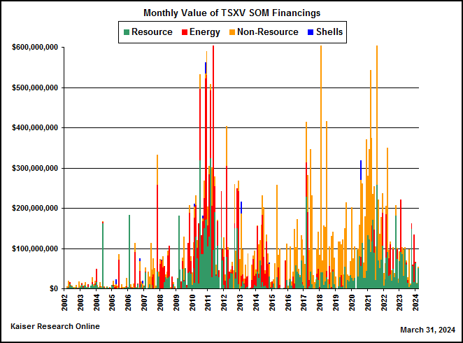
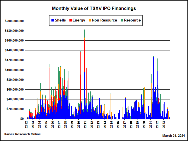
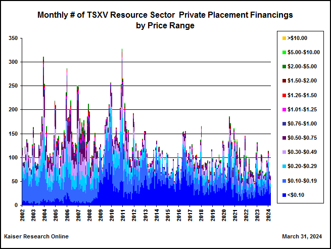
| Statistics for only actively trading TSXV listed companies featured on Kaiser Research Online |
|---|
 |
 |
 |
 |
 |
 |
 |
 |
 |
 |
 |
 |
 |
 |
 |
 |
 |
 |
 |
 |
 |
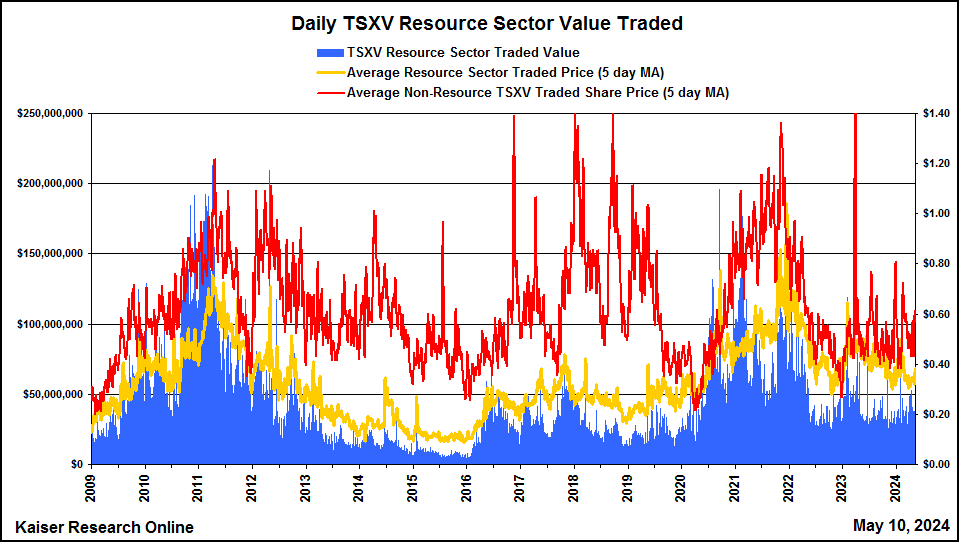
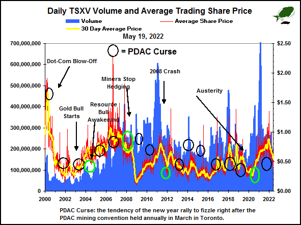
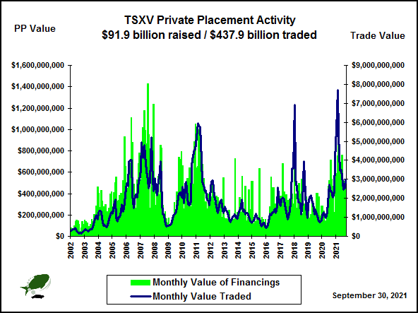
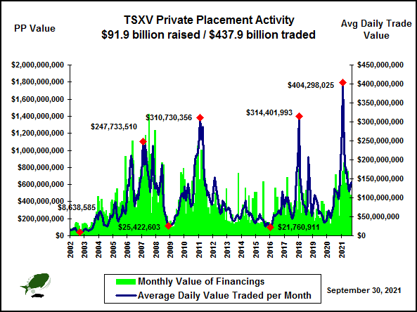
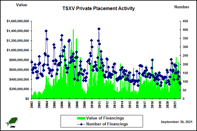
| TSXV Private Placement Timebomb Chart: this chart reveals how much equity has been raised by TSXV listings through private placements during each month (the green bar), how much private placement equity is tied up by the four month hold restriction on private placements (the purple bar - the "timebomb"), the total value traded each month by TSXV listings (the red ) and what percentage the timebomb represents of the total value traded that month (the yellow line). When an investor buys private placement stock the money goes into the corporate treasury. When the four month hold period is over the investor typically hopes to sell the stock, especially if the private placement stock included a warrant which allows the investor to buy more stock at a fixed price for 1-2 years. Except for the "friends and associates" exemption, only "sophisticated investors" are entitled to buy private placement stock. A "sophisticated investor" is either an institution such as a mutual or hedge fund, or an individual with a net worth of $1 million or more. A common strategy among sophisticated investors is to clip the warrant after the 4 month hold ends and flip the stock into the market, preferably at breakeven or for a profit. The warrant becomes a free ride on the possible success of the company, and the investor is free to roll the recovered capital into another private placement. This "clip and flip" strategy allows an investor to accumulate a portfolio of risk free exposure to TSXV listings, and is much beloved by brokers who reap big commissions while preserving their clients' capital. A "timebomb problem" develops when the after-market is not large enough to absorb the private placement paper when it comes free trading. When the monthly value traded (red line represented by the 0-$6 billion scale on the left) soars relative to the timebomb, it has bullish implications for the market because it signals that new money is moving directly into the market. The bigger the value traded compared to the timebomb, the healthier the outlook for the market. The ratio of value traded to the timebomb is depicted as the yellow line, which is represented by the 0-250% scale on the right. A high value traded to timebomb ratio will not indicate what traded value will be in subsequent months as the timebomb paper comes free trading, but when the percentage drops (ie below 100%) the outlook for the market becomes negative because the liquidity is not present to absorb paper coming free trading. The outcome of such a situation is usually lower stock prices until the timebomb paper has washed out and been absorbed by the after market. |
 |
 |
 |
 |
 |
 |
 |
 |
 |
 |
 |
 |
 |
 |
 |
 |
 |
 |
 |
 |
 |
 |
 |
 |
 |
 |
|
| |
| | You can return to the Top of this page
|
|